miba

miba

Project

miba Redesign

Year

2026

Services

  • Positioning
  • Logo development
  • Brand Strategy
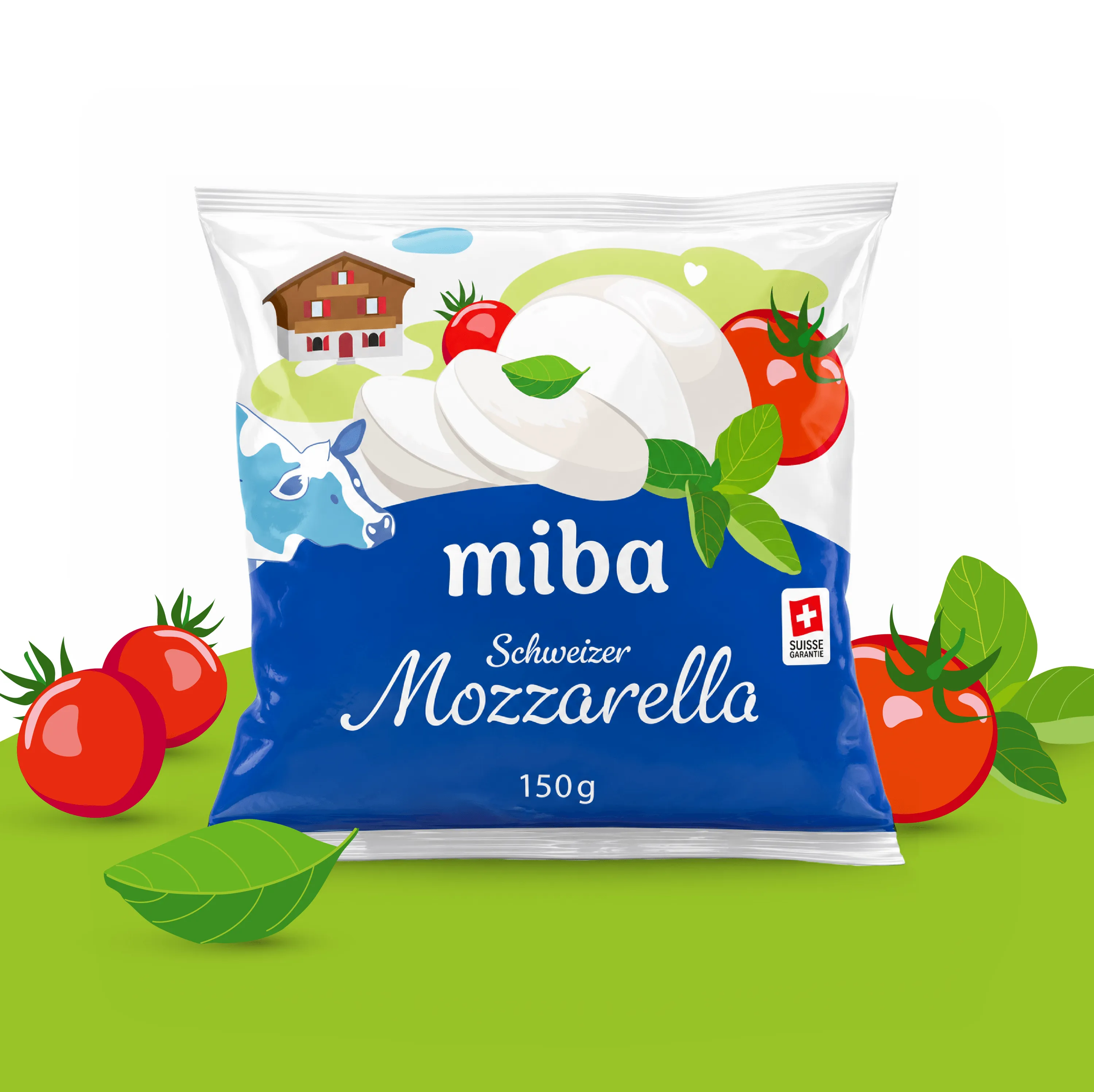
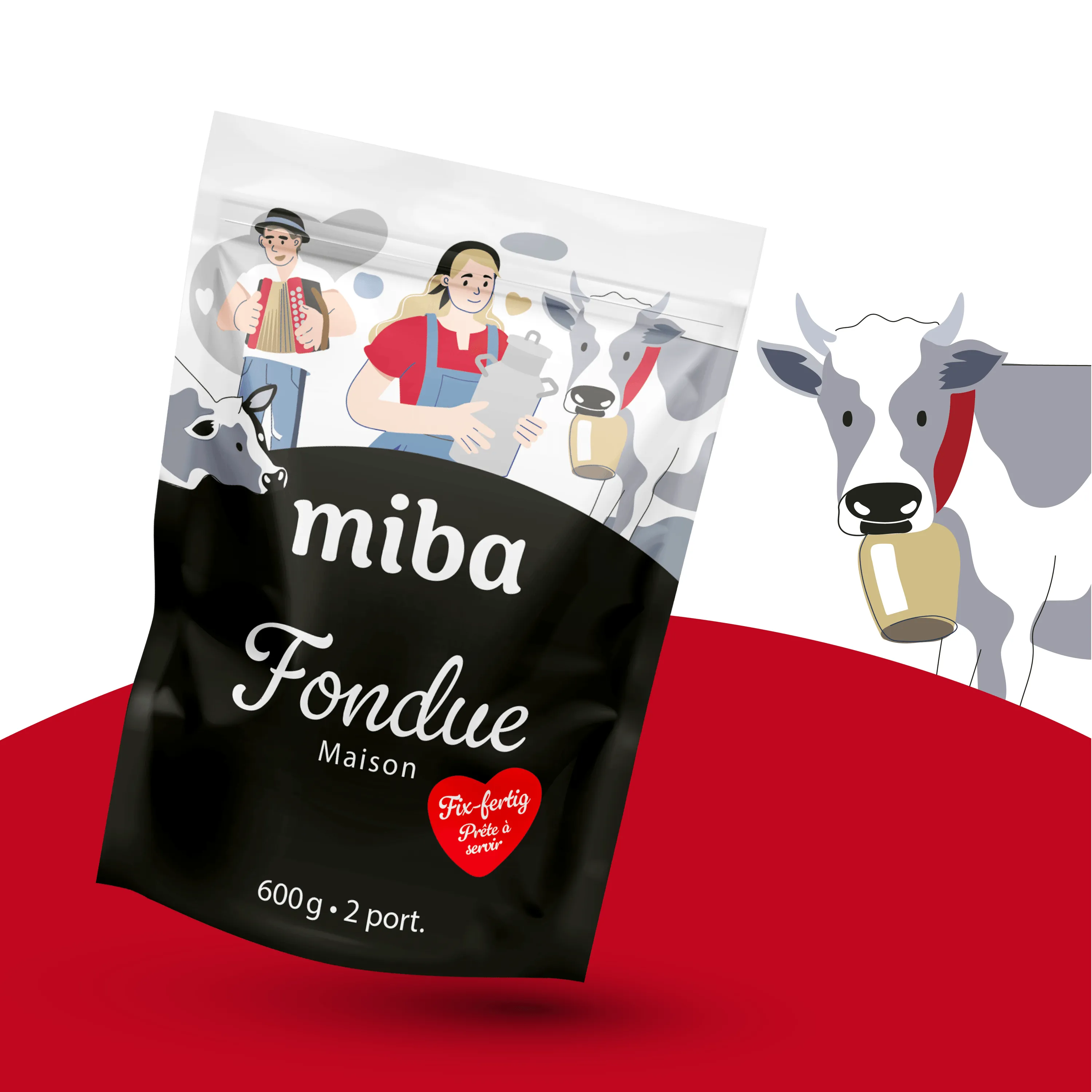
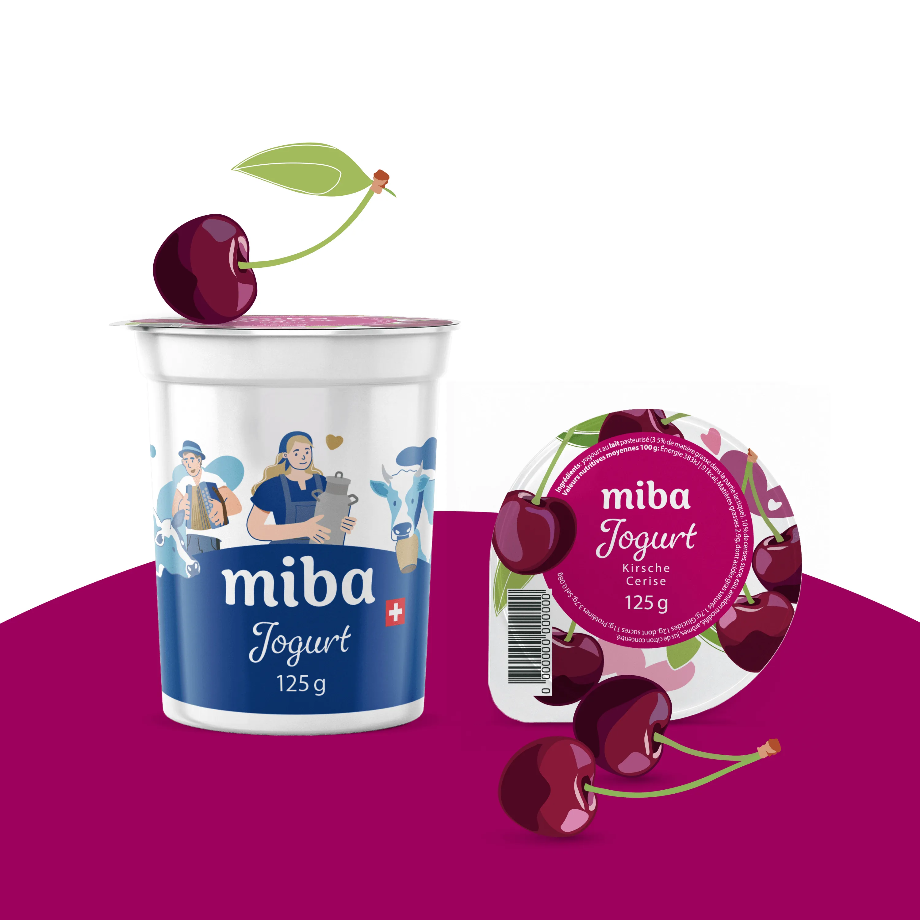
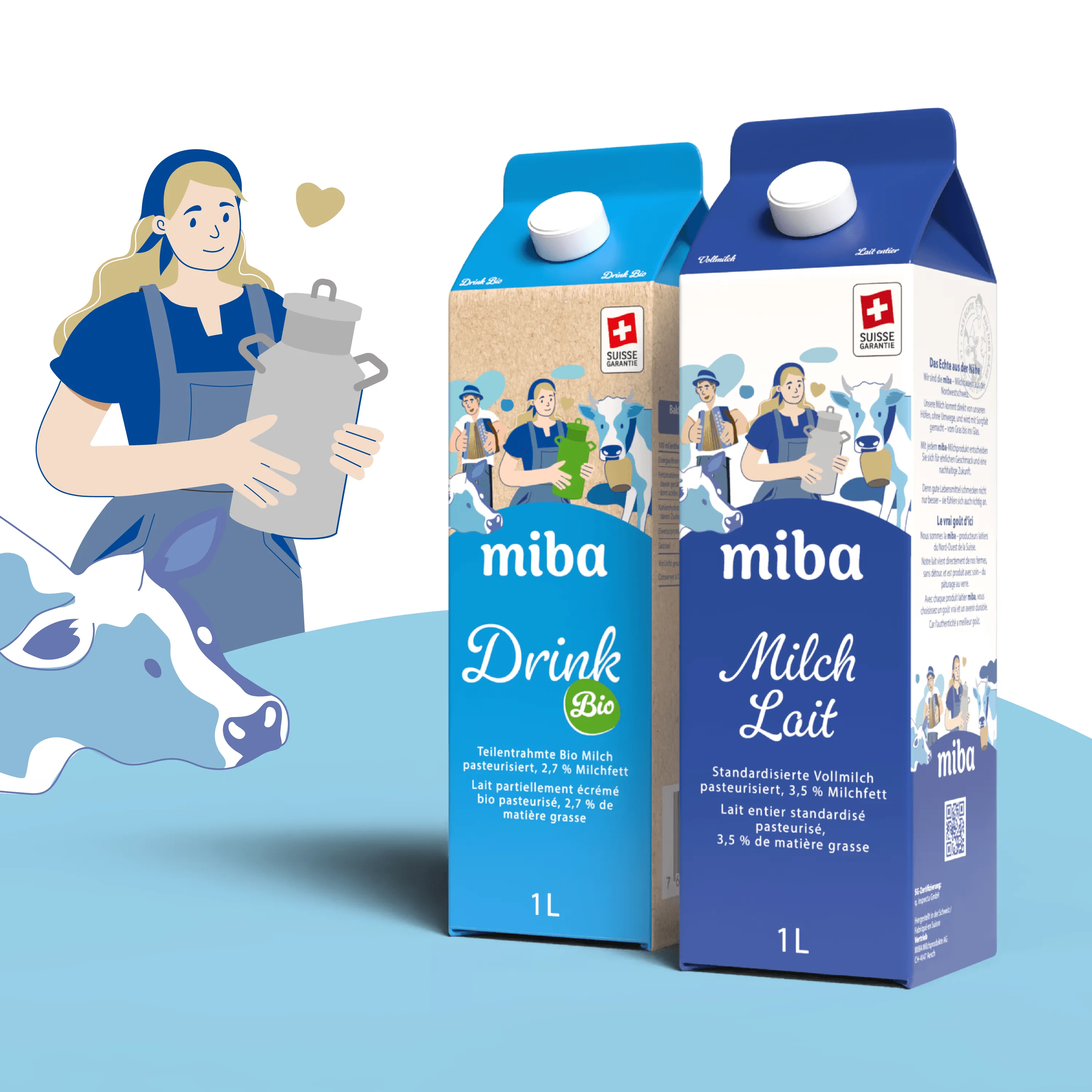
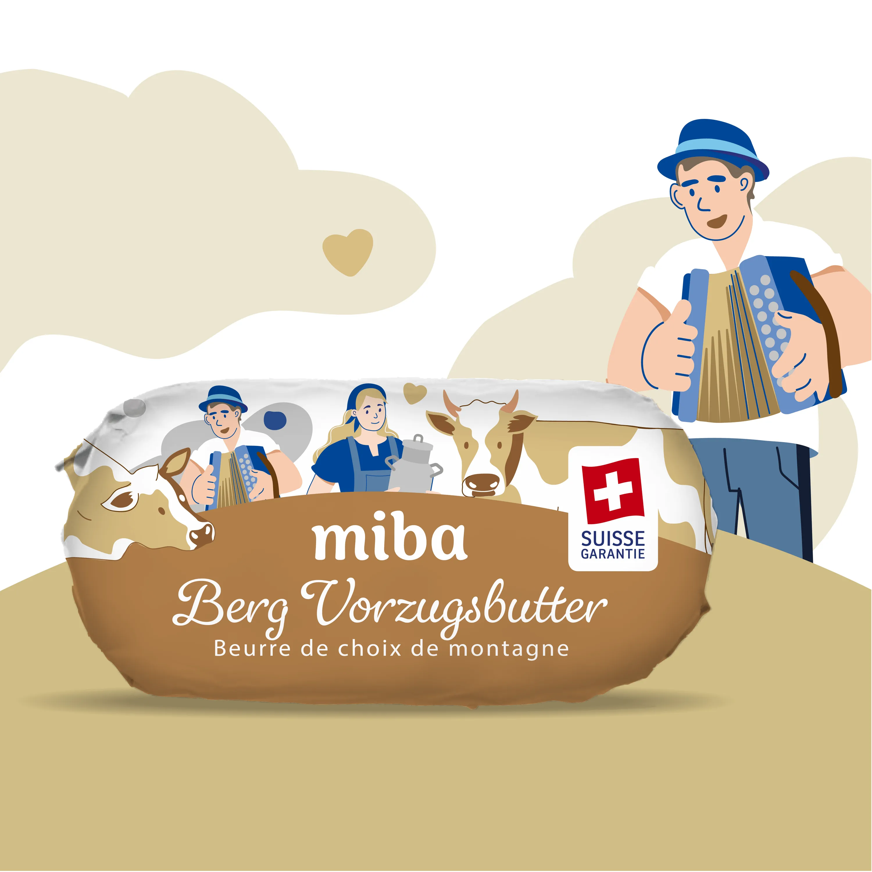
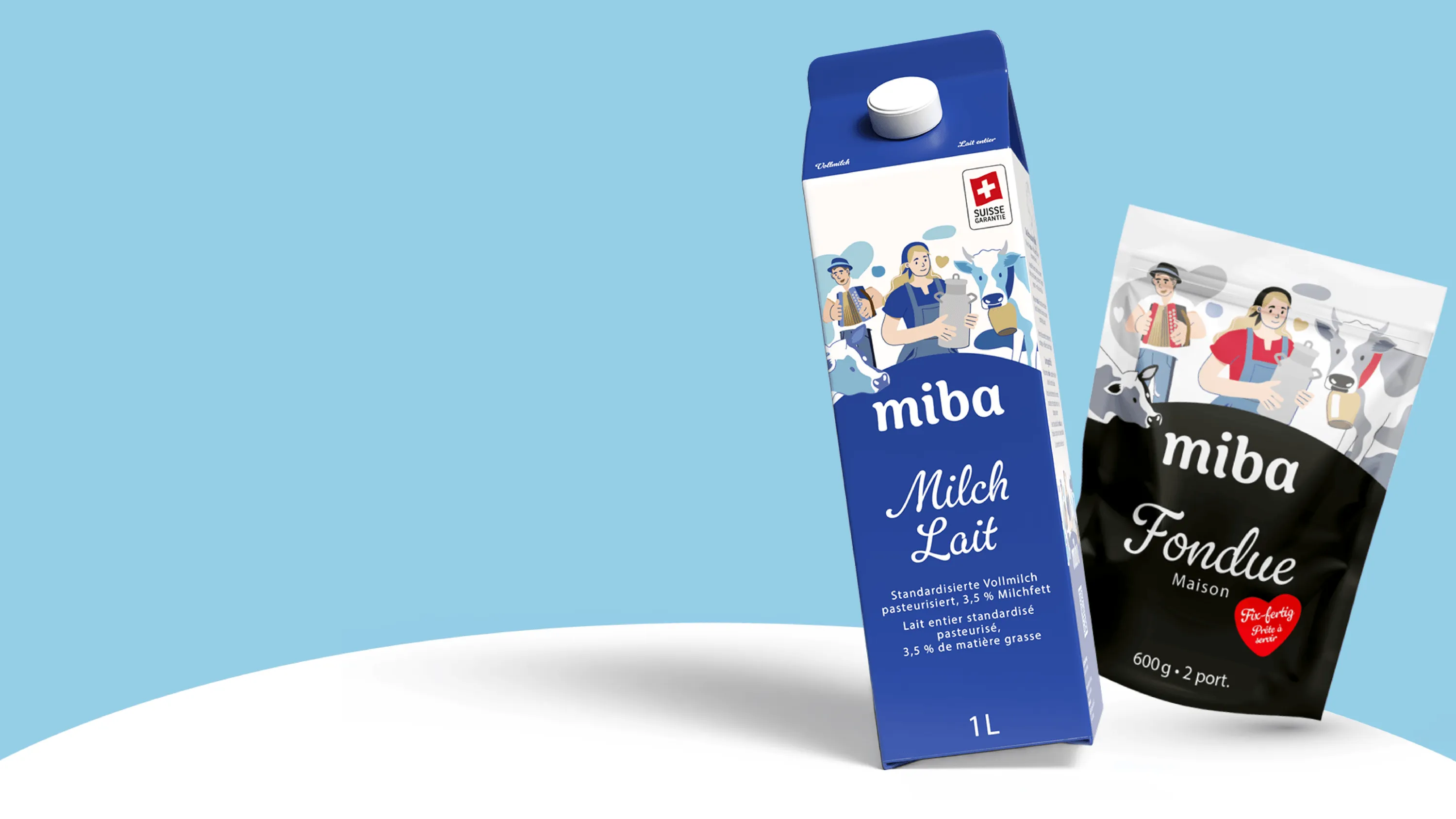
  • Packaging Design

Closeness that connects

How do you bring the values of a dairy cooperative to life through a brand?

Together with miba, the cooperative representing dairy farmers in Northwestern Switzerland, we strategically repositioned the brand and fundamentally redefined its visual identity, from the logo to the packaging.

At the heart of the project was one key question: What makes miba unique?
Closeness at the heart of the brand

Workshops and in-depth discussions led to a central insight: closeness lies at the heart of miba.

A cooperative with deep roots in its region. The bond between dairy farmers, their animals and their land. And the connection between the people who produce the milk and those who want to know where their food comes from.

For miba, this connection is more than a philosophy – it is part of the product itself. All miba products are made exclusively with milk from farms belonging to the cooperative.

Closeness thus became the guiding principle behind the entire brand development.

Our approach

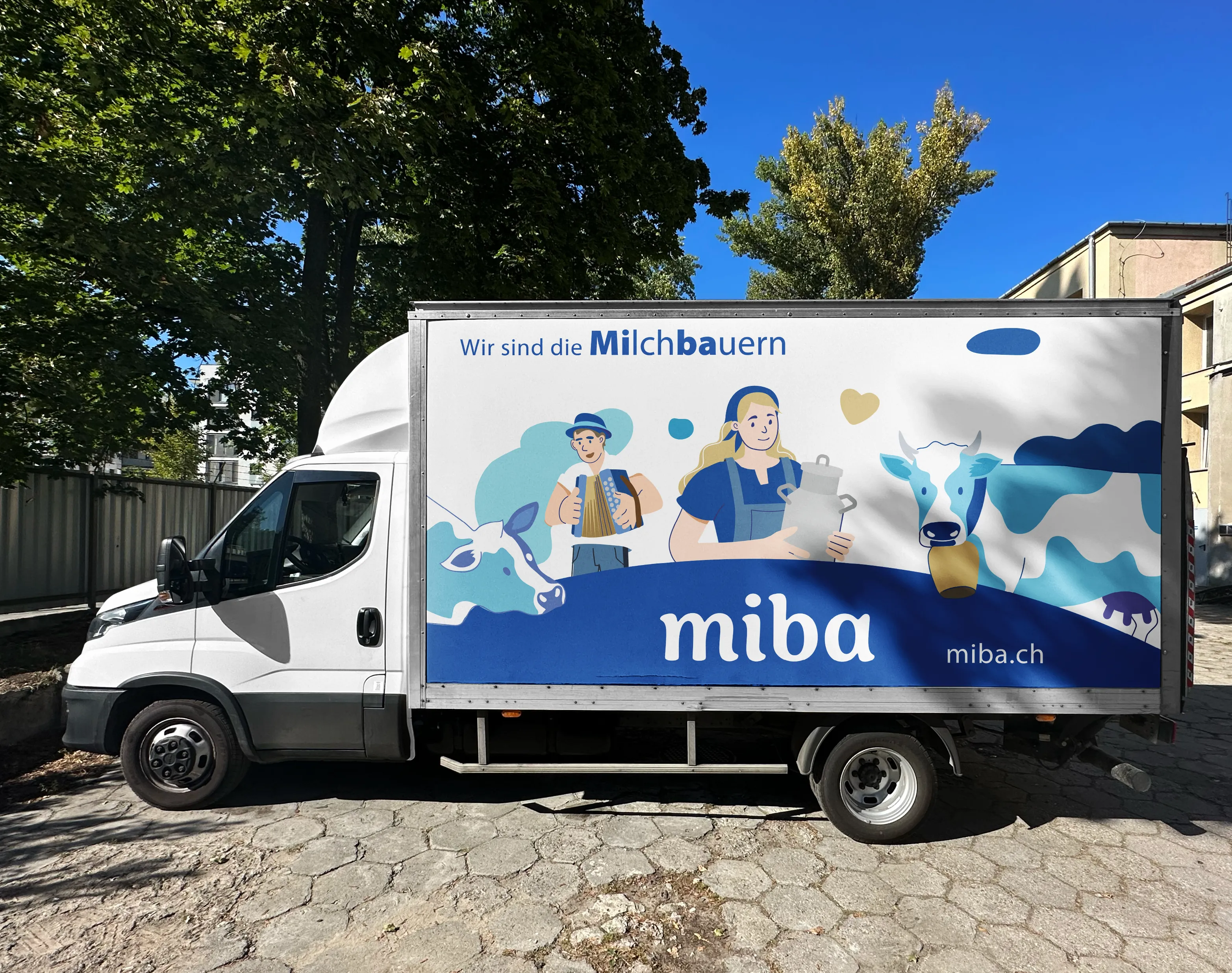
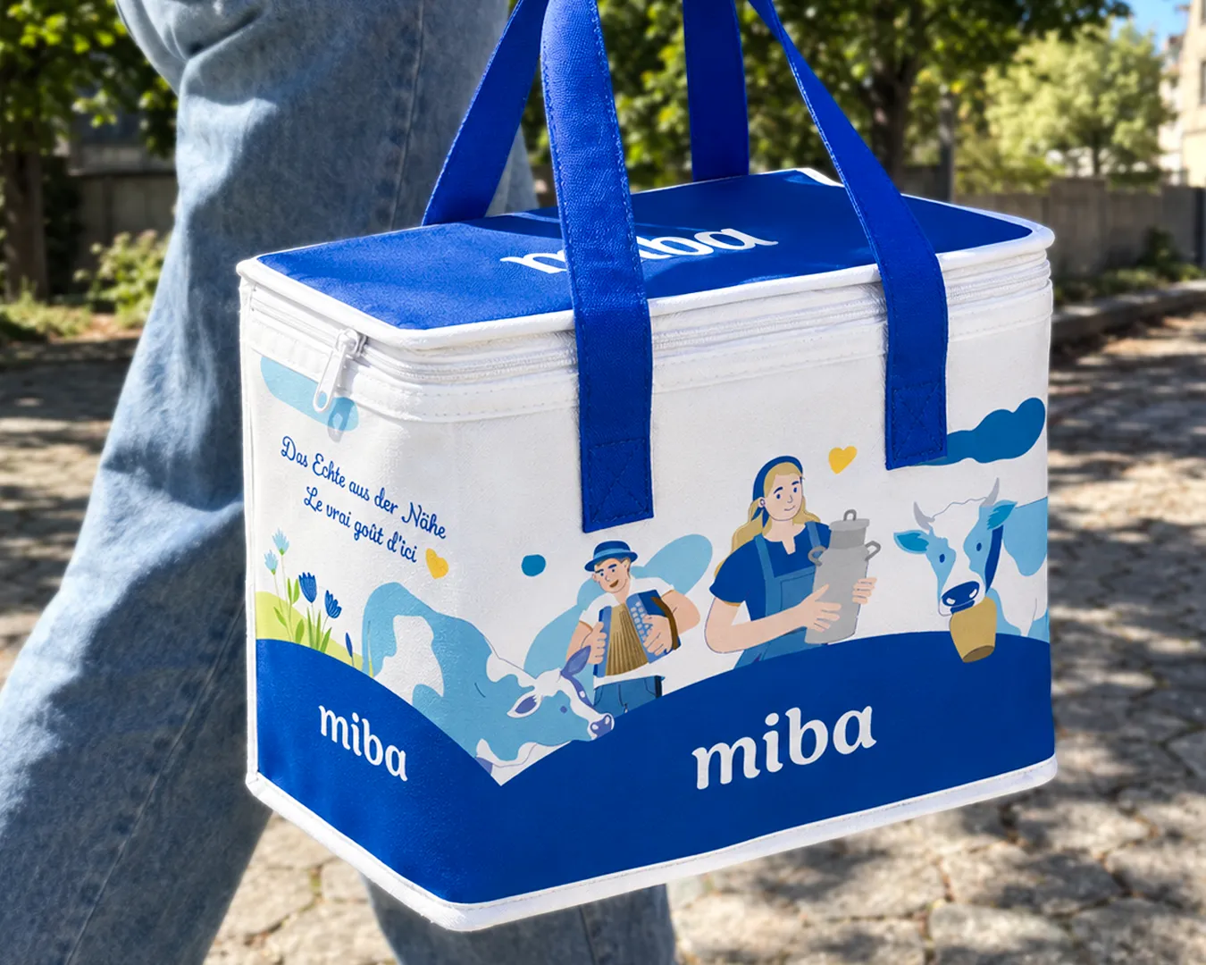
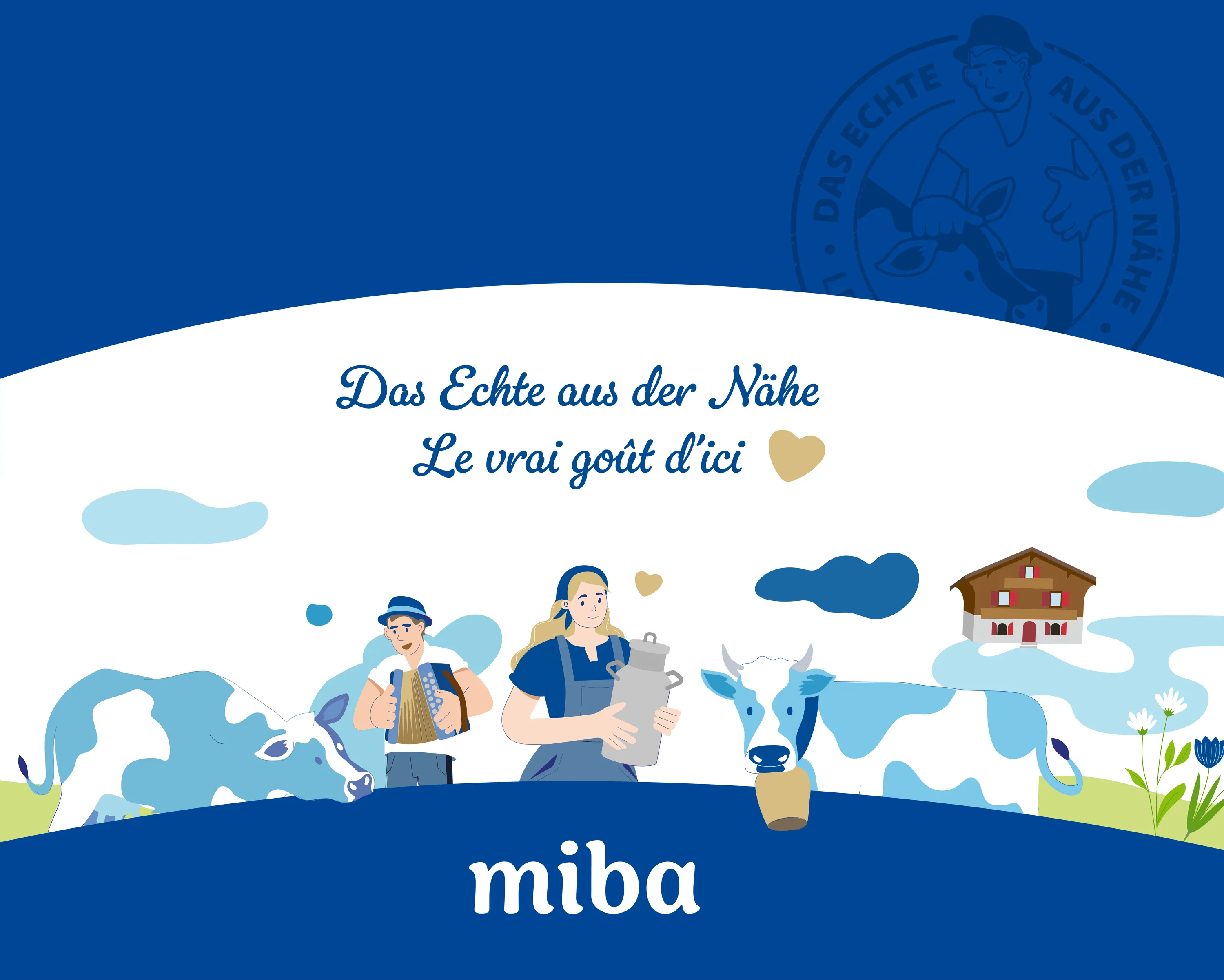
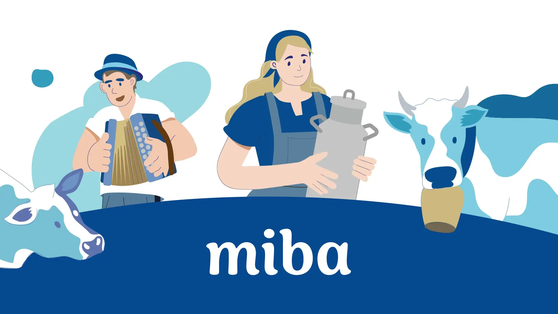
The aim was to make this closeness visible and tangible, rather than simply talk about it. The new design therefore puts the people behind the brand, whose work brings it to life every day, centre stage.

Poetic illustrations tell stories from the everyday lives of dairy farmers, revealing what often remains unseen: their care, dedication and connection to their animals, the land and the region.

From the logo to the packaging, a distinctive visual identity translates miba’s values into a unique visual language.

The new brand brings together heritage and the present, making miba’s defining quality visible: a sense of closeness that connects people, products and the region.

keep scrolling for the next project

Bosch
Bosch