Bosch

Bosch

Project

Bosch Mobility Solutions - Redesign

Year

2013

Services

  • Brand architecture
  • Brand Strategy
  • Packaging Design

A design built for global demands

Mobility Solutions is by far Bosch’s largest business sector. With more than 650,000 SKUs and products serving a wide range of markets, Bosch faced a complex challenge: creating a new packaging design that would ensure a consistent and recognisable brand image worldwide while meeting the diverse needs of different markets, products and target groups.

In the automotive aftermarket, finding the right product quickly is essential. How does a customer find the right windscreen wiper for their VW Golf III? How does a mechanic identify the correct brake pads for a BMW M3? Which information matters, and in what order should it be presented?

The key challenge was therefore to build clear guidance into the design and turn the packaging into an effective decision-making tool.
Premium quality, distinctively packaged

Bosch products are used around the world, but local market conditions vary considerably. Purchasing power is higher in Europe than in emerging markets, while vehicles in South America and India tend to be used for longer and more intensively than in the US. At the same time, certain customer groups, such as those in competitive motorsports, have particularly high quality expectations.

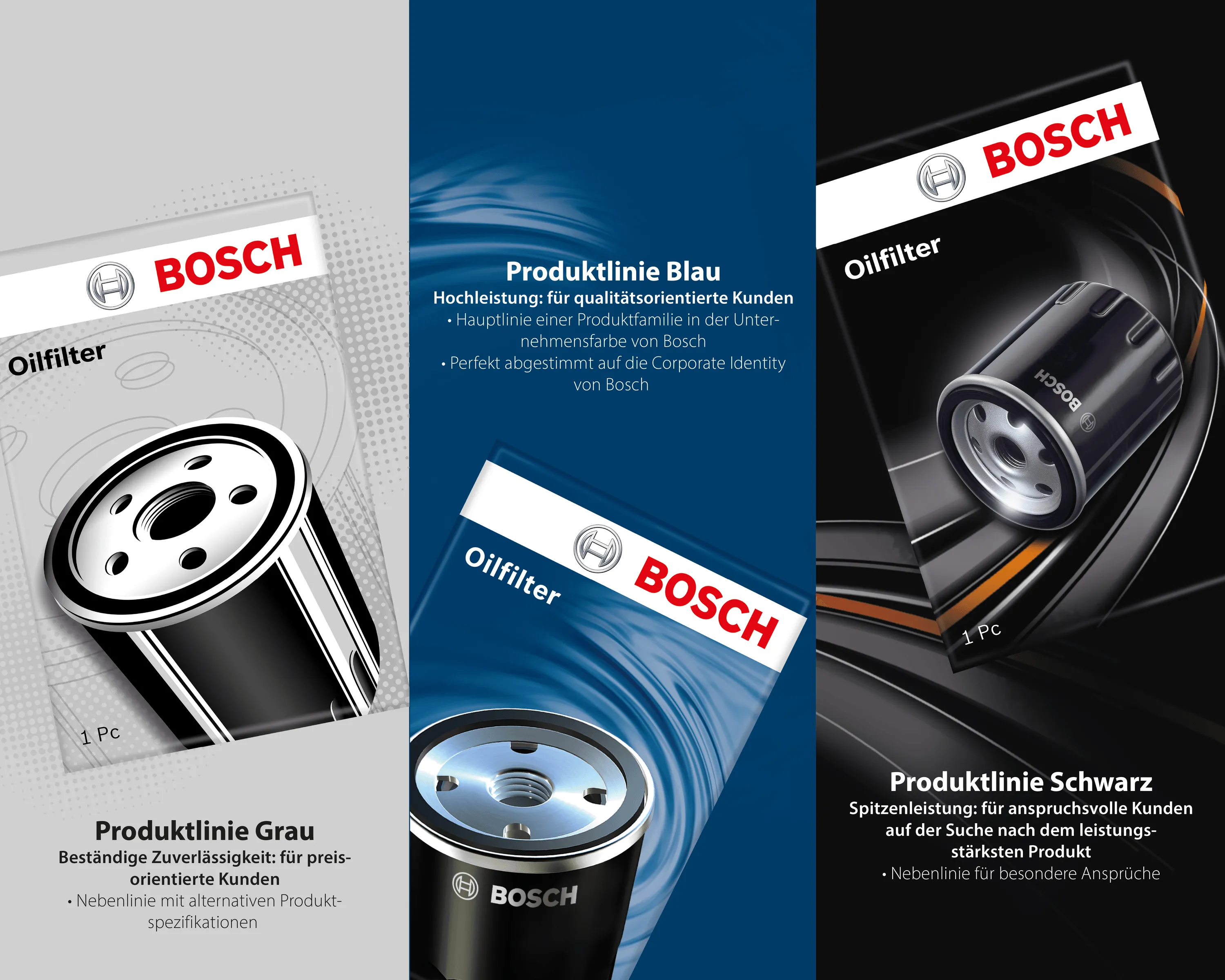
The task was to develop three product lines with different performance specifications while uniting them through a shared, emotionally engaging visual language.

Our approach

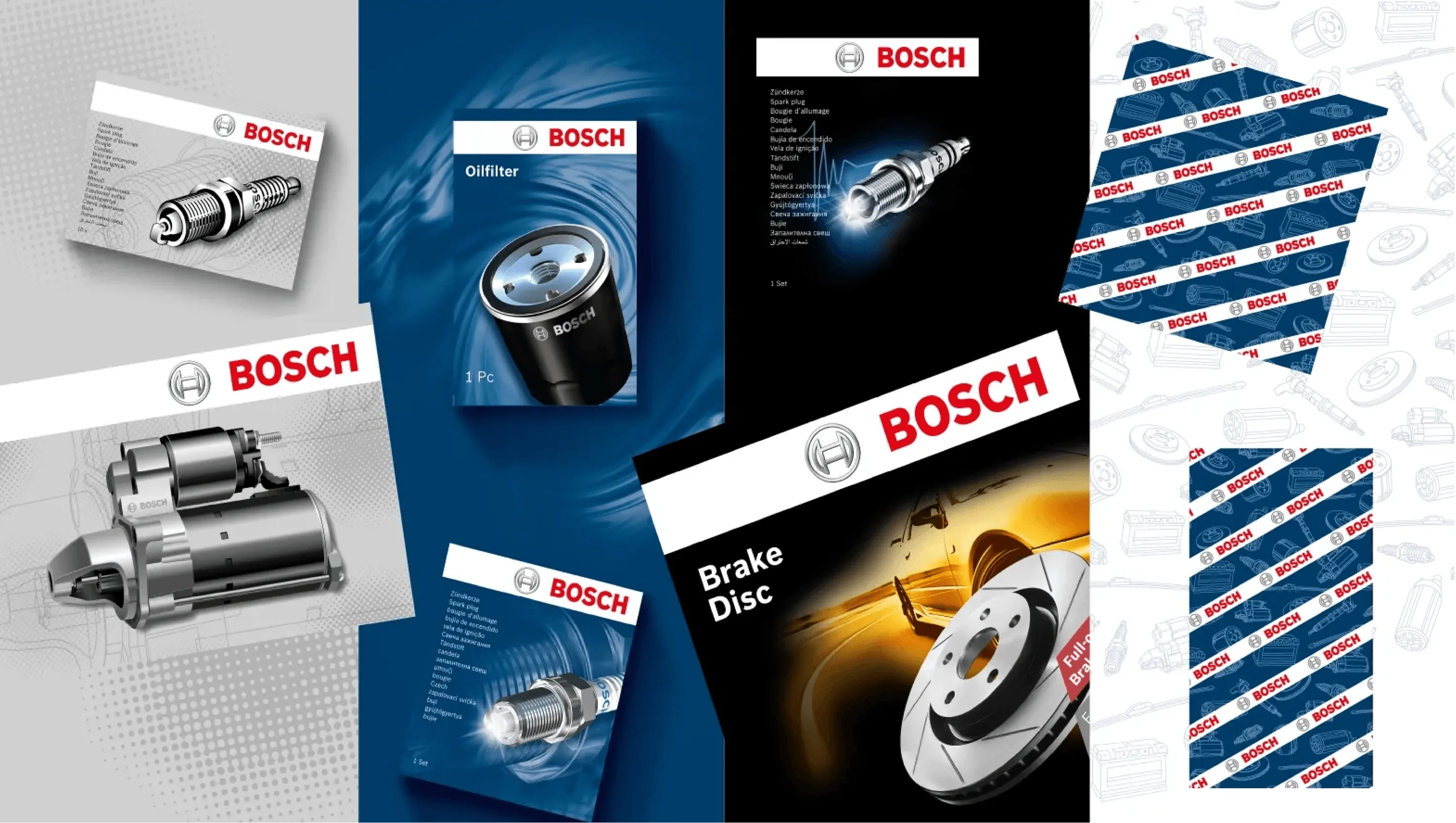
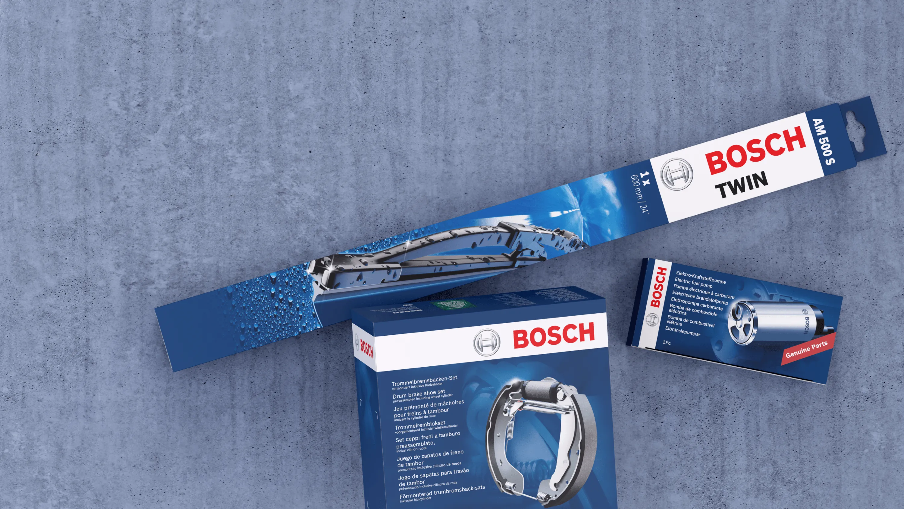
A flexible design system clearly differentiates between product specifications while maintaining a consistent Bosch brand identity.

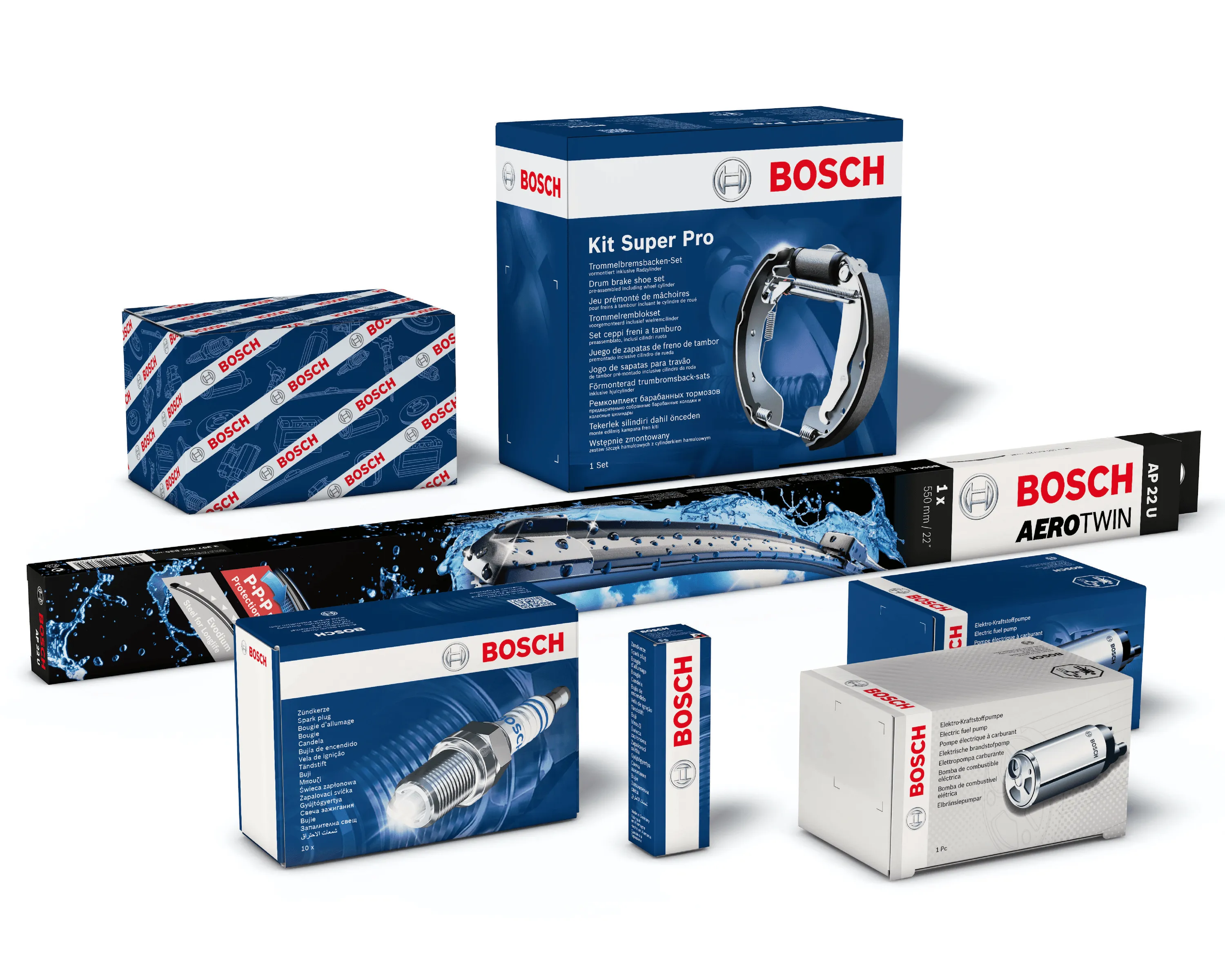
The grey design line represents products with alternative specifications, the blue line stands for original equipment quality, and the black line is reserved for products meeting particularly high standards. The system is complemented by dedicated workshop packaging for professional users.

A clear information hierarchy ensures that relevant product information can be quickly understood. The different performance promises are communicated through a cohesive, emotionally engaging visual language that connects all three lines.

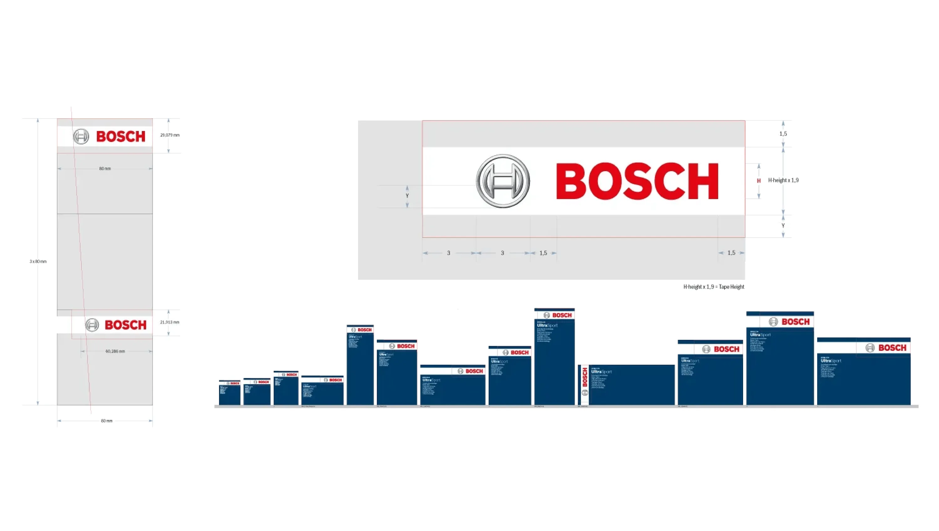
The implementation across thousands of products and a wide variety of packaging formats was also systematised. A mathematical formula for calculating the optimal logo size ensures that the logo is scaled correctly for every format.

The result is a globally deployable design system that improves product navigation, accommodates different product requirements and ensures a consistent Bosch brand presence across the entire portfolio.

keep scrolling for the next project

Coop Vitality
Coop Vitality