Verfora

Anti Brumm

Project

Anti-Brumm Redesign

Year

2026

Services

  • Brand Strategy
  • Packaging Design

Preserving brand strength, increasing relevance

How do you modernise a strong brand without losing its recognisability?

This was the key question behind the redesign of Anti-Brumm, the leading brand for mosquito and tick protection in Switzerland and Germany.

The challenge was to visually reinforce its market-leading position and give the brand a more contemporary look without losing its distinctive brand codes.
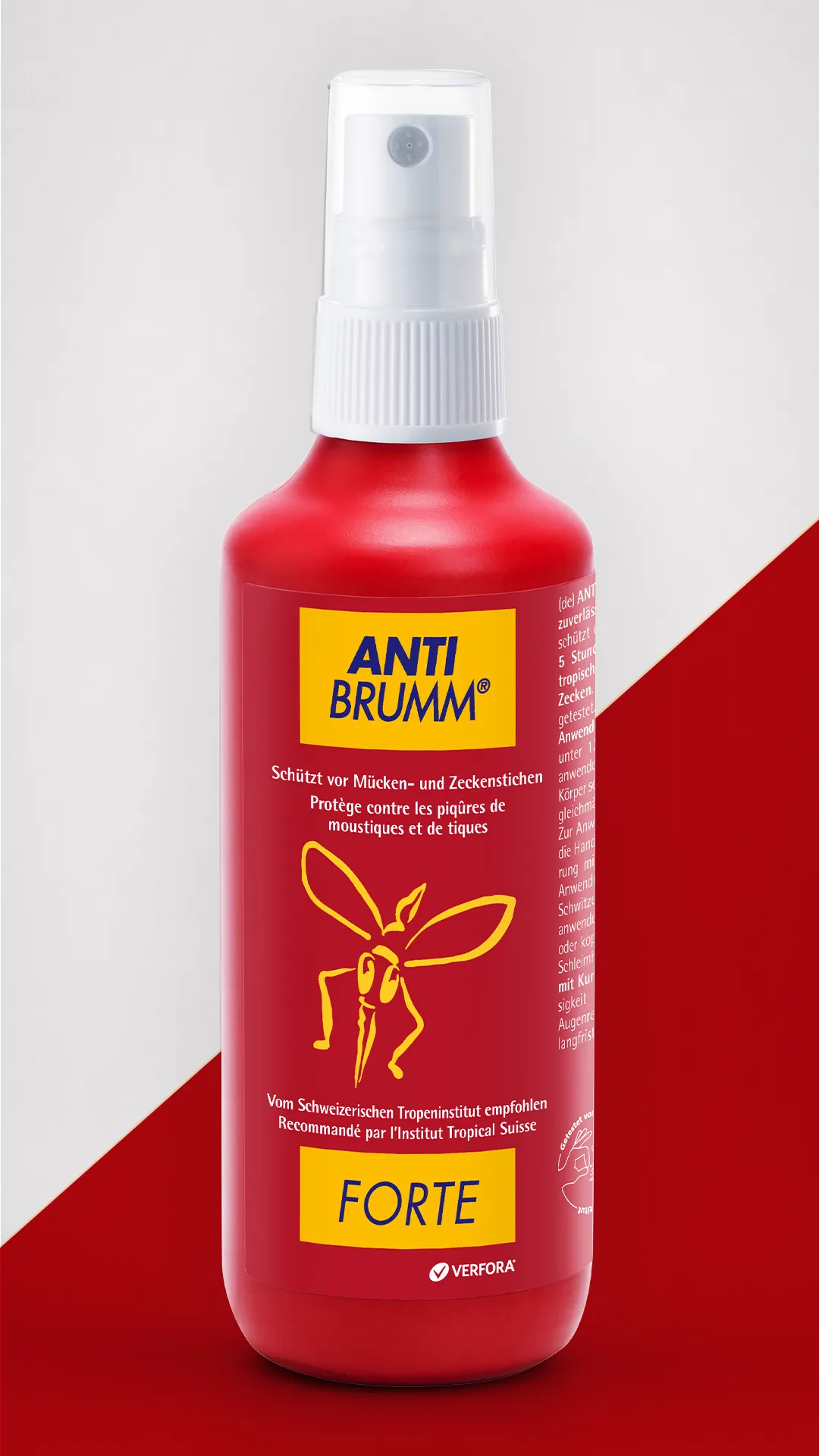
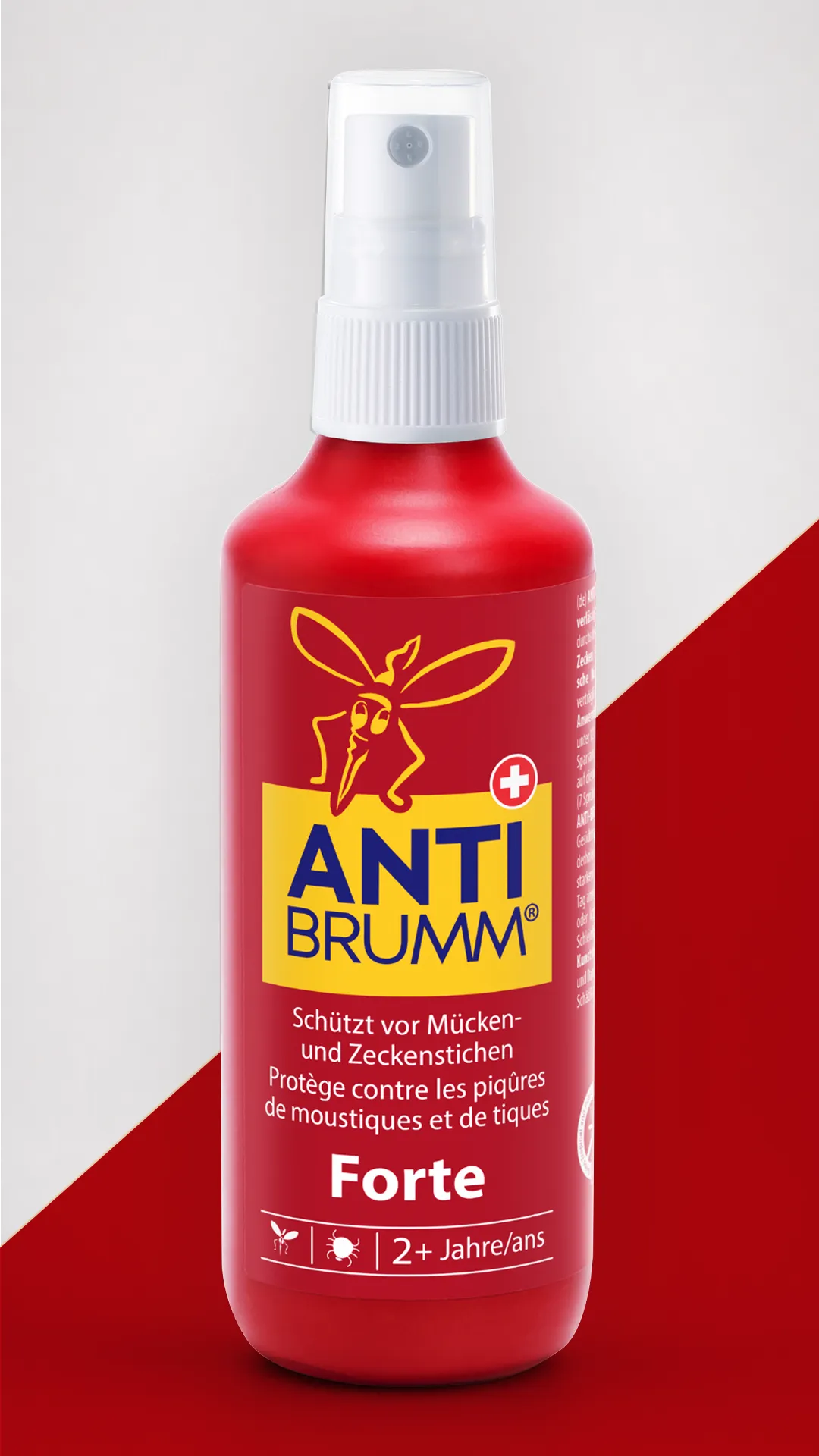
Staying familiar, looking fresh

Anti-Brumm enjoys high brand awareness and strong recognition. The redesign therefore needed to build on the existing brand identity rather than break away from it, refining, simplifying and reinterpreting its distinctive elements in a contemporary way.

At the same time, the goal was to improve shelf navigation and make the brand’s core values of efficacy and safety more visible.

Our approach

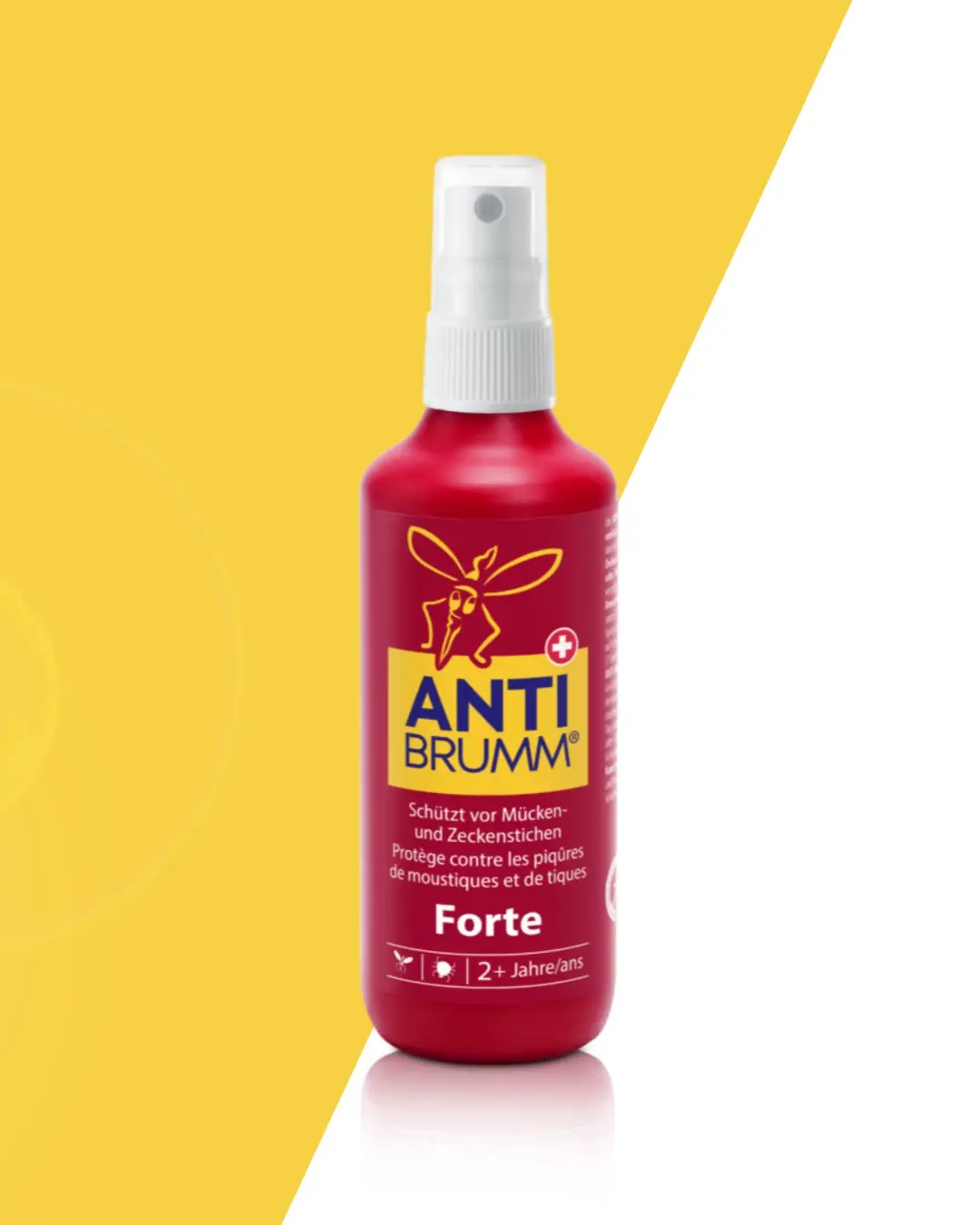
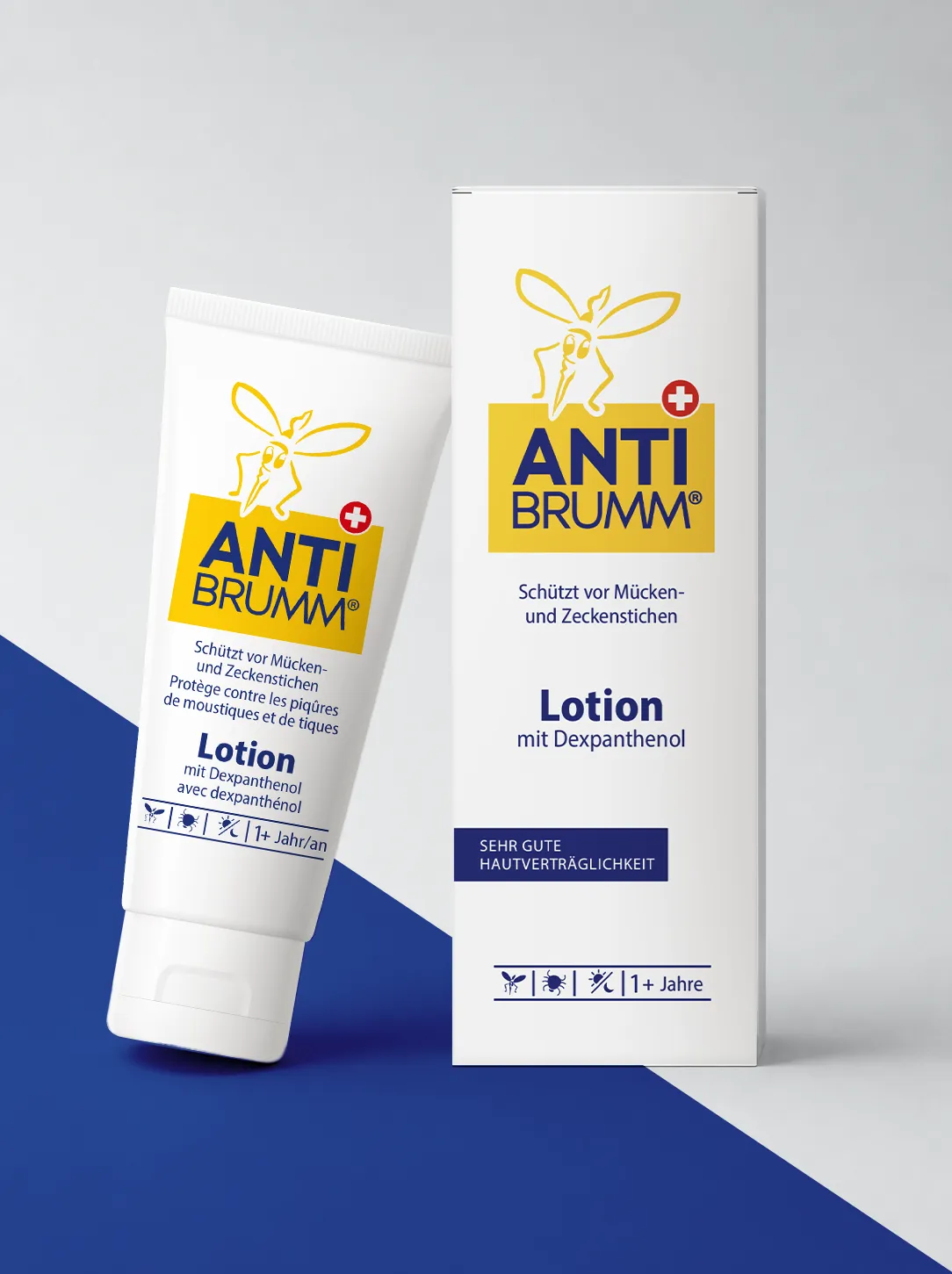
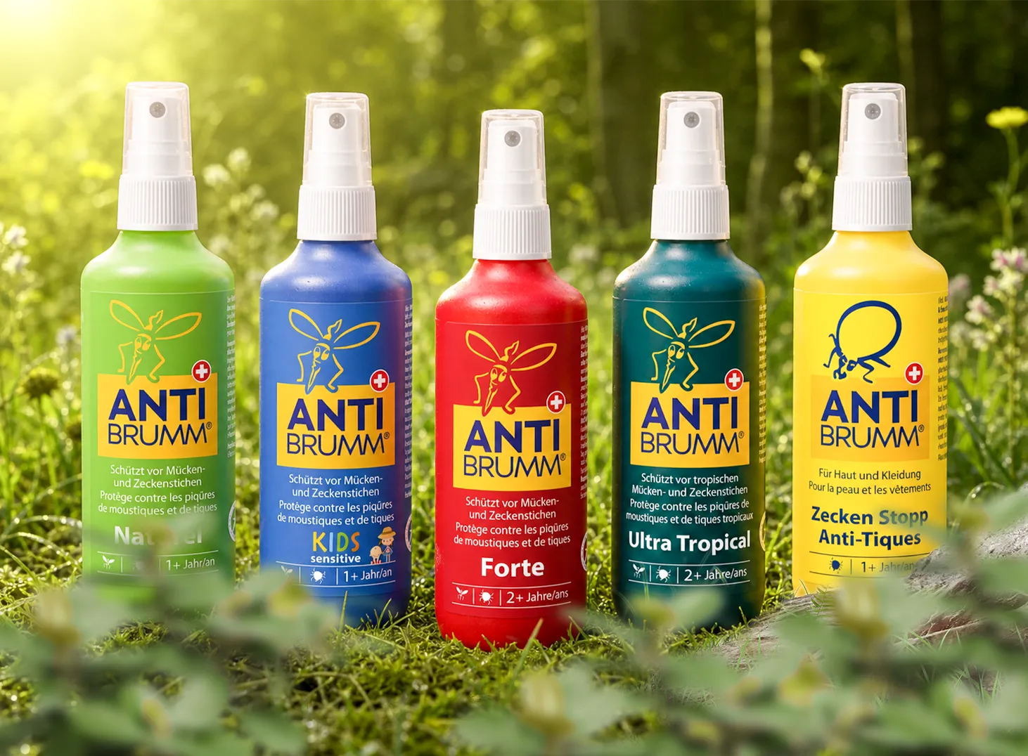
A more prominent logo, combined with the iconic mosquito, strengthens the brand presence and ensures instant recognition.

A more streamlined design language, featuring clear typography, simplified illustrations and more precise shapes, gives the brand a cleaner, more contemporary appearance.

An optimised information hierarchy creates a clearer structure and makes it easier for shoppers to find their way around at the shelf. At the same time, efficacy and safety take centre stage.

The result is a more modern and confident Anti-Brumm brand presence that preserves its familiar brand codes while creating renewed relevance.

Before
After
BeforeAfter

keep scrolling for the next project

miba
miba